10 Best Free Tamil Google Fonts for Beautiful Web and Print Design
If you are building a bilingual website, designing a mobile app, or putting together a printed brochure, finding the right Tamil typeface is critical for readability and aesthetics. Thankfully, Google Fonts offers an excellent selection of open-source Tamil fonts that pair perfectly with Latin scripts, ensuring your designs remain cohesive and professional.
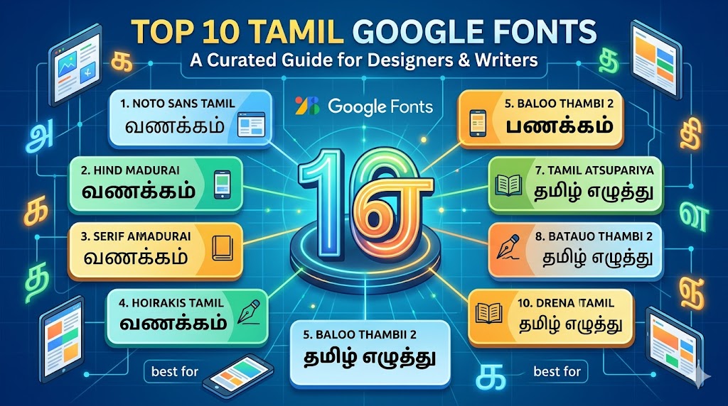
Here is a curated list of the top 10 Tamil Google Fonts available today, complete with links so you can start using them right away!
1. Noto Sans Tamil
-
Style: Sans Serif (Unmodulated)
-
Best For: Clean UI, dense body text, and modern web design.
-
Overview: Part of Google’s massive Noto project—designed to eliminate "tofu" (missing character boxes) across the web—Noto Sans Tamil is a workhorse. With multiple weights and widths, it’s highly readable across different screen sizes and devices.
2. Hind Madurai
-
Style: Humanist Sans Serif
-
Best For: User Interface (UI) design and electronic display embedding.
-
Overview: Developed specifically for user interfaces, Hind Madurai has flat stroke endings and open apertures. The Tamil characters are perfectly scaled to match the Latin characters, making it one of the best options for bilingual websites.
3. Catamaran
-
Style: Sans Serif
-
Best For: Striking headlines and versatile editorial layouts.
-
Overview: Catamaran is a highly versatile, 9-weight text type family designed for the digital age. It strikes a beautiful balance between traditional typographic conventions and a modern, sparkling aesthetic.
4. Mukta Malar
-
Style: Sans Serif
-
Best For: Multi-script projects and contemporary digital reading.
-
Overview: Part of the Ek Type collective's multi-script project, Mukta Malar is clean, highly legible, and features extensive support. It handles complex Tamil conjuncts gracefully while matching the visual weight of its Latin counterparts.
5. Baloo Thambi 2
-
Style: Display / Rounded Sans
-
Best For: Playful branding, large headings, and children's books.
-
Overview: Carefree yet confident, Baloo Thambi 2 brings a warm, bouncy energy to your text. Though it is heavily stylized with rounded, heavy strokes, its lighter weights still offer surprising legibility for shorter paragraphs.
6. Kavivanar
-
Style: Handwriting / Calligraphic
-
Best For: Invitations, stylized quotes, and textured body text.
-
Overview: Inspired by the handwriting of a Sri Lankan Tamil poet, Kavivanar is somewhat bold and slightly slanted. The letterforms retain a beautiful calligraphic pen stress, giving the text an authentic, lively, and organic rhythm.
7. Pavanam
-
Style: Sans Serif
-
Best For: Small screens, print media, and dense editorial content.
-
Overview: Named after the Tamil word for "wind," Pavanam was designed with a heavy focus on legibility at small sizes. Its Latin counterpart is based on Pontano Sans, adjusted precisely to match the vertical metrics of the Tamil glyphs.
8. Arima
-
Style: Calligraphic Display
-
Best For: Brand names, elegant headlines, and web headers.
-
Overview: Arima (which encompasses the Tamil-supporting Arima Madurai) has soft edges and a distinctive calligraphic feel. While it functions as a display font loaded with personality, it maintains low contrast specifically to render smoothly on mobile phone screens.
9. Noto Serif Tamil
-
Style: Serif (Modulated)
-
Best For: Formal documents, academic texts, and printed books.
-
Overview: If you need a more traditional, modulated stroke for long-form reading in print, Noto Serif Tamil is an outstanding choice. Like its Sans sibling, it comes in multiple weights and brings an elegant, classic feel to your typography.
10. Meera Inimai
-
Style: Grotesque Sans Serif
-
Best For: Pamphlets, single-page designs, and digital body text.
-
Overview: Meera Inimai leans into the naturally vertically-elliptical characteristics of the Tamil script. The Latin characters are custom-built to complement this shape, resulting in a highly uniform and modern visual texture.
Typography Tip: When pairing Tamil and English on the same page, always test the line heights (leading). Tamil script naturally features distinct ascenders and descenders that often require slightly more breathing room than standard Latin text!